
| 일 | 월 | 화 | 수 | 목 | 금 | 토 |
|---|---|---|---|---|---|---|
| 1 | 2 | 3 | 4 | 5 | 6 | |
| 7 | 8 | 9 | 10 | 11 | 12 | 13 |
| 14 | 15 | 16 | 17 | 18 | 19 | 20 |
| 21 | 22 | 23 | 24 | 25 | 26 | 27 |
| 28 | 29 | 30 |
- 알고리즘
- PYTHON
- web
- 알고리즘 연습
- react
- c++
- django widget
- 알고리즘 문제
- java
- 백준
- Algorithm
- HTML
- django rest framework
- django ORM
- es6
- DRF
- CSS
- API
- 파이썬 알고리즘
- Django
- form
- js
- Baekjoon
- 장고
- 파이썬
- Git
- AWS
- javascript
- 알고리즘 풀이
- MAC
- Today
- Total
수학과의 좌충우돌 프로그래밍
[인공지능] PCA (2) python 을 사용한 PCA 실습 본문
[인공지능] PCA (1) Principle Component Analysis 란?
실무에서 접하게 되는 데이터는 feature의 수가 대체로 큽니다. 이는 생각보다 더 큰 문제로 작용합니다. 당연히 데이터의 크기가 크다보니 학습 속도에도 영향을 미치고 다루기가 쉽지 않습니다. 따라서 차원의..
ssungkang.tistory.com
PCA 를 통해 차원을 축소했으면 시각화 해서 나타낼 수 있습니다. 그 과정을 실습을 통해 보도록 하겠습니다. 실습 환경은 google colab 에서 진행했습니다.
기본 설정
import pandas as pd
import numpy as np
import matplotlib.pyplot as plt
from sklearn.decomposition import PCA
from sklearn.preprocessing import StandardScaler

%matplotlib inline
기본적으로 쓰이는 pandas, numpy, matplotlib 등과 sklearn 에서 지원해주는 PCA, StandardScaler 를 import 했습니다.
%matplotlib inline 은 notebook을 실행한 브라우저에서 바로 rich output 을 볼 수 있게 해주는 것 입니다.
rich output
도표와 같은 그림, 소리, 애니메이션 과 같은 결과물을 말합니다.
데이터 불러오기
colab 은 data 를 불러오기 위해 파일을 업로드 해야 합니다. 파일을 업로드 한 후, 이를 read_csv 로 읽어 dataFrame 을 만듭니다.
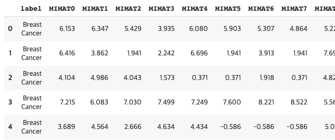
현재 데이터는 micro RNA 의 MIMAT 에 대한 데이터로 MIMAT에 따라 어느 암인지 label로 나타냅니다. 크기는 4046명의 사람에 대해, 2565 feature 로 나타내고 있어 4046 * 2565 입니다.
from google.colab import files
uploaded = files.upload()

nameList = ["MIMAT"+str(i) for i in range(2565)]
nameList.insert(0, "label")

import io
dataFrame = pd.read_csv(io.BytesIO(uploaded['4046.csv']), names=nameList)
데이터 전처리
가져온 데이터에 대해서 label 과 값들로 나누어주었습니다.
StandardScaler 를 통해 데이터를 단위 분산으로 조정합니다. 평균을 0, 분산을 1 로 만들어줍니다.
x = dataFrame.loc[:,nameList[1:]].values
"""
array([[ 6.153,  6.347,  5.429, ...,  0.333,  0.333,  2.802],
       [ 6.416,  3.862,  1.941, ...,  1.941,  1.941,  1.941],
       [ 4.104,  4.986,  4.043, ...,  0.371,  0.371,  0.371],
       ...,
       [-1.646,  3.695,  3.28 , ...,  4.805,  2.246,  2.647],
       [ 3.952,  2.935,  5.201, ...,  4.716, -1.769, -1.769],
       [ 1.381,  3.657,  2.588, ...,  4.837, -0.379, -0.379]])
"""
x = StandardScaler().fit_transform(x)
"""
array([[ 1.65097478,  1.66169329,  1.57733547, ..., -1.23004378, 0.60509558,  1.52490408],
       [ 1.72583763,  0.83339925,  0.53013649, ..., -0.40494629, 1.23123397,  1.20587584],
       [ 1.06772773,  1.20804814,  1.16121799, ..., -1.21054521, 0.61989238,  0.62414027],
       ...,
       [-0.56900754,  0.77773522,  0.93214321, ...,  1.06463032, 1.34999779,  1.46747158],
       [ 1.02446099,  0.52441391,  1.50888325, ...,  1.01896261, -0.21340126, -0.16879867],
       [ 0.29262684,  0.76506916,  0.72438469, ...,  1.08105017, 0.32785022,  0.34624111]])
"""


y = dataFrame.loc[:,['label']].values
"""
array([['Breast Cancer'],
       ['Breast Cancer'],
       ['Breast Cancer'],
       ...,
       ['Sarcoma'],
       ['Sarcoma'],
       ['Sarcoma']], dtype=object)
"""
PCA Projection to 2D
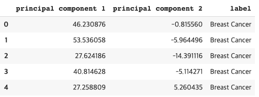
PCA 를 이용해서 쉽게 차원을 축소시키고, 새로 만들어진 데이터로 dataframe 을 만들어줍니다.
pca = PCA(n_components = 2)
principalComponents = pca.fit_transform(x)
principalDf = pd.DataFrame(data = principalComponents
             , columns = ['principal component 1', 'principal component 2'])
기존에 있던 label 과 합쳐줍니다.
finalDataFrame = pd.concat([principalDf, dataFrame[['label']]], axis=1)
각 암들의 label 을 중복을 제거하여, labels 라는 list 에 담아주고
labels = []
yList = y.tolist()
for label in yList:
  if label[0] not in labels:
    labels.append(label[0])

labels
"""
['Breast Cancer',
 'Colorectal Cancer',
 'Esophageal Cancer',
 'Gastric Cancer',
 'Hepatocellular Carcinoma',
 'Lung Cancer',
 'non-Cancer',
 'Benign Ovarian Disease',
 'Borderline Ovarian Tumor',
 'Ovarian Cancer',
 'OV_others',
 'Pancreatic Cancer',
 'Sarcoma']
 """
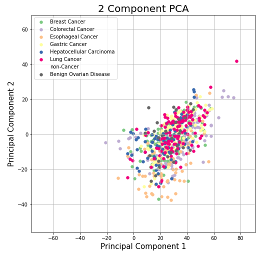
이에 대해 이미지로 나타냅니다.
color 는 여기 에서 쉽게 구분되는 색을 찾을 수 있습니다. non-cancer 의 경우, 데이터의 수가 너무 많아 다른 데이터를 가리기 때문에 색을 없애주었습니다.
fig = plt.figure(figsize = (8,8))
ax = fig.add_subplot(1,1,1)
ax.set_xlabel('Principal Component 1', fontsize = 15)
ax.set_ylabel('Principal Component 2', fontsize = 15)
ax.set_title('2 Component PCA', fontsize = 20)

colors = ["#7fc97f","#beaed4","#fdc086","#ffff99","#386cb0","#f0027f","","#666666"]
for label, color in zip(labels, colors):
  indicesToKeep = finalDataFrame['label'] == label
  ax.scatter(finalDataFrame.loc[indicesToKeep, 'principal component 1']
               , finalDataFrame.loc[indicesToKeep, 'principal component 2']
               , c = color
               , s = 30)

ax.legend(labels)
ax.grid()
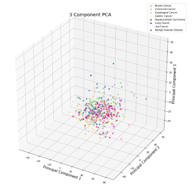
PCA Projection to 3D
2D 로 봤을 때 구분이 되지 않았기 때문에 3D 로 확장시켜보았습니다. 위와 같은 과정을 거치고 column 이 하나 증가했을 뿐 입니다.
pca2 = PCA(n_components=3)
principalComponents2 = pca2.fit_transform(x)
principalDf2 = pd.DataFrame(data = principalComponents2
             , columns = ['principal component '+str(i) for i in range(1,4)])

finalDataFrame2 = pd.concat([principalDf2, dataFrame[['label']]], axis=1)
Axes3D 은 사용하지는 않지만 import 해야 3D 이미지를 그릴 수 있습니다.
from mpl_toolkits.mplot3d import Axes3D

fig2 = plt.figure(figsize=(15,15))
ax2 = fig2.add_subplot(111, projection='3d')

ax2.set_xlabel('Principal Component 1', fontsize = 15)
ax2.set_ylabel('Principal Component 2', fontsize = 15)
ax2.set_zlabel('Principal Component 3', fontsize = 15)
ax2.set_title('3 Component PCA', fontsize = 20)

colors = ["#7fc97f","#beaed4","#fdc086","#ffff99","#386cb0","#f0027f","","#666666"]
for label, color in zip(labels, colors):
  indicesToKeep = finalDataFrame2['label'] == label
  ax2.scatter(finalDataFrame2.loc[indicesToKeep, 'principal component 1']
               , finalDataFrame2.loc[indicesToKeep, 'principal component 2']
               , finalDataFrame2.loc[indicesToKeep, 'principal component 3']
               , c = color
               , s = 30)

ax2.legend(labels)
ax2.grid()
결론
결과적으로 PCA 가 성공적이지는 못했습니다. 2D 나 3D 나 데이터가 구분되는 모습을 보이지 않습니다. 데이터의 차원이 2565 였기 때문에 2,3차원으로 줄였을 경우, 손실이 많이 일어난 것 같습니다. 주어진 데이터에 대해서는 다른 방법을 적용해봐야 할 듯 합니다.
'인공지능' 카테고리의 다른 글
| [인공지능] PCA (1) Principle Component Analysis 란? (2) | 2019.08.20 |
|---|
